UI/UX Design
Uncovering Friction in the Flow
A UX Audit of DRL’s OPD App
Reading the Digital Pulse
The DRL OPD app, vital for outpatient care, was showing signs of UX fatigue—visual inconsistencies, unclear flows, and cognitive friction.
This wasn’t a rebuild, but a deep audit to uncover gaps and realign the experience around users.
My Role: I led a UX audit of the DRL OPD application, identifying usability gaps and mapping design recommendations based on DRL’s current visual system. My work included interface analysis, heuristic evaluation, journey reviews, and proposing alignment strategies.
“The app works, but it doesn't feel like one product.”
The Audit Begins
Our audit started with a clear question:
What’s breaking the user experience—and how do we fix it
without changing functionality?
What We Evaluated:


Diagnosis Through Design Heuristics
We mapped findings against established heuristics (Nielsen’s 10) and user expectations.


Prescribing Design Clarity
We proposed solutions based on the audit findings—focused on alignment, simplicity, and speed.
Recommendations
-
Unify Components: Align typography, icons, and button styles across all screens
-
Structure with Hierarchy: Use contrast and spacing to visually group related elements
-
Enhance Feedback: Add hover/active states and clearer error messaging
-
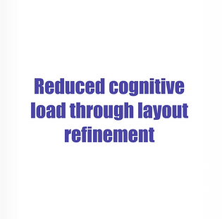
Declutter Screens: Reduce text blocks, increase whitespace, and use progressive disclosure
What We Achieved


“Now it feels like one, cohesive application.” – Stakeholder
What I Learned
Designing for healthcare taught me that clarity is a feature—not a layer.
-
UX audits reveal how small details add up to big friction
-
A style guide is only powerful when applied consistently
-
Simplicity often means removing, not adding