top of page
UI/UX Design
Clarity in Chaos
A UX Journey with Shipyaari
India runs on logistics. From Jaipur’s jewelry sellers to Mumbai’s D2C brands, small businesses depend on shipping aggregators to deliver.
But behind the scenes? Confusing dashboards and scattered data leave users overwhelmed.
That’s where we stepped in.
My Role: I led the redesign of Shipyaari’s seller portal in a 5-designer team, working in 1-week agile sprints. I handled UX from research to prototyping and managed the design-to-dev handover.
Tools: Figma, Miro, Notion, Maze, Google Forms, Loom
The Wake Up Call
Shipyaari had the scale, but not the clarity.
As the platform grew, its responsive interface left core users lost in complexity. We set out not just to redesign, but to realign — turning a confusing journey into a confident one.

Listening Between the Lines
User Research & Persona
Through deep-dive interviews, surveys, and journey mapping, we uncovered three recurring seller archetypes:


They were all telling us the same thing in different ways:
"I need to feel like I’m in control."
Redesigning for Confidence
UX Strategy, IA, and User Flows
We reimagined the seller portal from scratch.
Simplified Flows
Order creation became a guided 3-step process

Information Architecture
Card sorting sessions led to reorganized menus based on task intent

User Flows
Reduced redundant clicks; clearer paths to goal completion
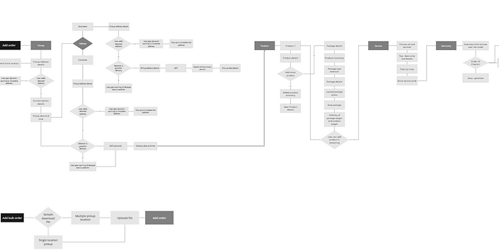
One seller clicked 12 times to upload an order.
We cut it to 3.
Specific Flow: Add Order (Single/Combo Product)
Combo Product Creation

Add multiple products, get box suggestions with live space and weight—cutting errors and shipping costs.


Product & Category Selection
Users can choose single or combo products from their saved library. Returning users see pre-filled product cards, while new users select from smart category (e.g., fragile, electronics).


Weight Discrepancy Check
After adding products, a pop-up shows discrepancy % with suggestions to adjust weight—helping reduce penalties and shipping issues.

Making Complexity Feel Simple
Wireframes & UI Design
Lo-Fi Wireframes
Tested with internal and external users

Hi-Fi Prototypes
Tested with internal and external users


Design System
Tested with internal and external users


Testing Assumptions
Usability Testing & Iteration
We validated the experience early and often—testing with real users, identifying friction points, and rapidly improving the design.


The Outcome
Metrics & Impact
We validated the experience early and often—testing with real users, identifying friction points, and rapidly improving the design.
↓ 35% decrease in navigation time
↑ Adoption rate of bulk upload feature
↑ Overall user satisfaction and NPS
What I Learned
Designing for logistics taught me that clarity is a feature—not a layer.
-
Small UX wins (like better labels) drive real results
-
Listening > assuming—users always reveal the truth
-
Iteration beats perfection, every single sprint
Good design isn’t noticed—it’s felt. Especially when it makes chaos feel calm
bottom of page